Linear Regression

Practice
practice problem 1
In the United States, electric energy is measured in kilowatt hours and purchased with dollars. This data set came from 12 months of electric bills for a New York City apartment in the early years of the 21st century.
- Plot a graph of cost vs. energy consumed and determine the equation of the best fit straight line.
- Explain the significance of the coefficients m, b, and r2.
solution
Here's what the graph looks like.
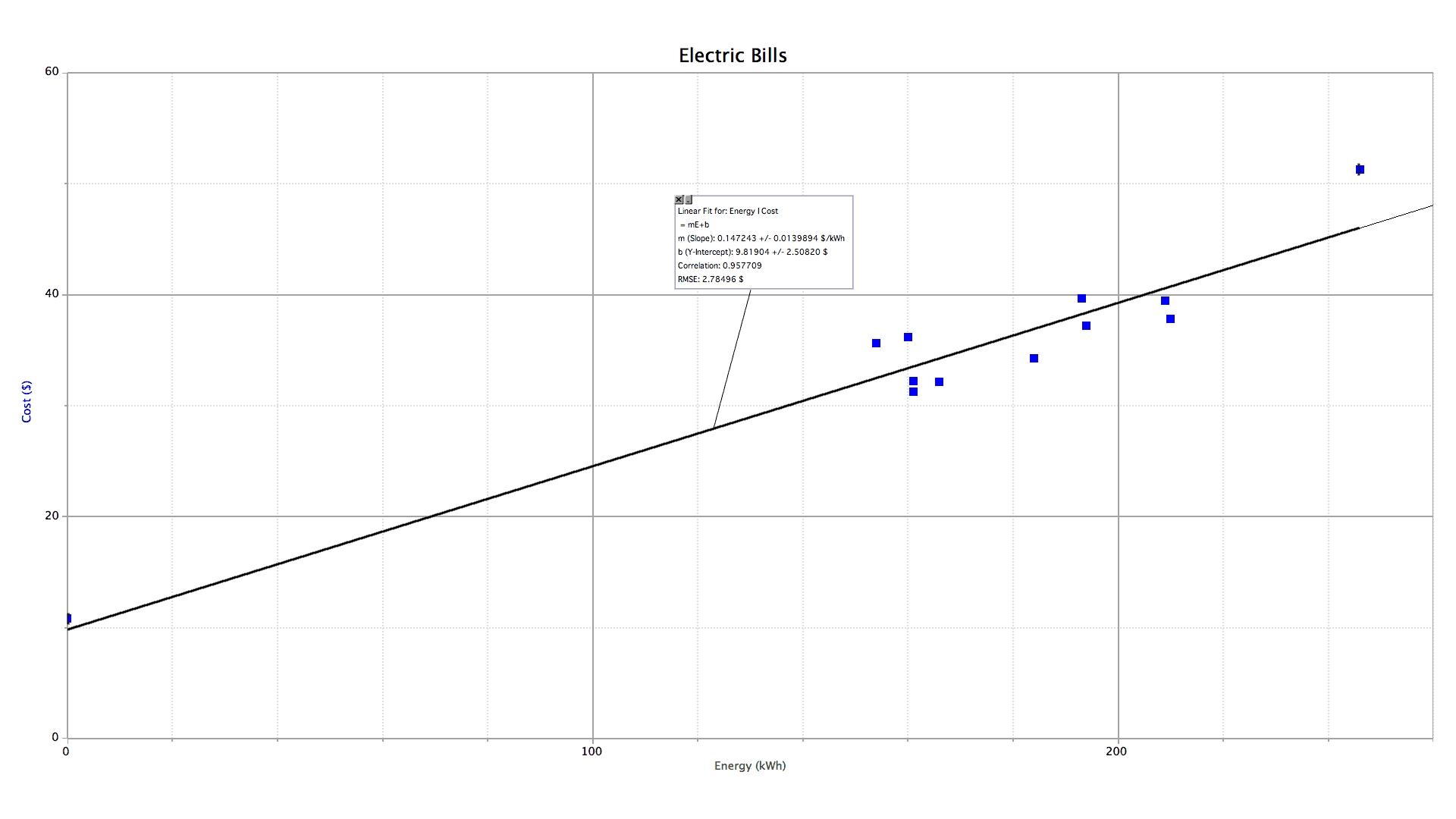
The slope (m) of a linear function is the rate of change of the vertical quantity (y) with respect to the horizontal quantity (x). It should be apparent that the slope of this graph is the average price for electricity per kilowatt hour. The real question should be, why doesn't this graph intercept the vertical axis at the origin? Surely, if I were to use no energy I should pay no money. When I don't go to a restaurant, I don't get charged. Why should electricity be any different? Well, there are two answers to this question. One is that utility companies as legal monopolies are trying to extract every penny they can from their captive customers. The second, which is the contention of the utilities themselves, is that there are fixed expenses associated with every customer regardless of how much energy they consume: maintenance, administration, insurance, etc. Such fixed expenses are gathered under the umbrella term "basic service charges". Thus, in this bill…
(the slope) is the residential rate for electric energy: 14.7¢ per kilowatt hour;
(the y-intercept) is the basic service charge: $9.81 per month. Note the lone data point on the left hand side of the graph that illustrates this policy. The entire house was on vacation for the entire month, the electricity was shut off at the circuit breaker, and yet still there was a charge.
-
(the correlation coefficient) shows the correlation between the energy and price: 0.96. The more important quantity for this analysis is the square of this number — the coefficient of determination: r2 = 0.92. This number shows that 92% of the variation in these electric bills is due to the amount of energy consumed. The remaining 8% variation is due to seasonal effects (electricity is always more expensive in summer when air conditioner use drives up demand) and bracket billing policies (the first quarter megawatt hour or so is cheaper than the rest with this utility). These secondary variations are evident in the data point in the extreme upper right hand corner of the graph that lies well above the line of best fit. It occurred during the summer when rates were at their highest.
practice problem 2
The text file referenced above has data on the world records for the 100 m dash. The data are broken up into four groups:
- men's electronically-timed world records
- men's hand-timed world records
- women's electronically-timed world records
- women's hand-timed world records
- Perform a linear regression on both men's and women's world record times as a function of the year the record was set.
- Explain the significance of the numerical results.
- Make an interesting prediction.
solution
The graph…

The numbers…
men y = mx + b m = −0.009052 s/yr b = +27.84 s r = −0.9511 The slope of this graph shows us that men's times are decreasing at approximately 0.01 seconds each year.
The y-intercept would be the world record in the year zero (a year that does not exist, by the way). Extrapolating this linear fit back 20 centuries would be a stupid thing to do. Surely there was someone around at the turn of the first millennium who could run a hundred meters in under 27 seconds.
The r value gives us an indication of how well the data can be explained by a linear model. Squaring −0.9511 gives us 0.9045, which means 90% of the variation in men's world record 100 m dash times is linear. That's quite a reasonable fit to an artificial model.
women y = mx + b m = −0.02399 s/yr b = 58.32 s r = −0.9199 Women's times are decreasing faster, about 0.02 seconds per year, approximately twice the rate of men.
The y-intercept for women is extra foolish. Nearly a minute to run 100 m? I don't think so. Linear regression is nice, but it isn't a religion. You don't have to believe everything it says.
The fit is not quite as tight for the women's times. Squaring −0.9199 yields a coefficient of determination of 0.8462. Thus a linear model only explains 85% of the variation in women's world record 100 m dash times. Still pretty good for a messy data set like this one.
I find it somewhat surprising that the trends in world record times can be so well explained by a linear model. I would have expected that the data would show the athletes approaching some limit. Surely, humans can't keep running faster and faster indefinitely. There must be some performance "wall" ahead of them — something to keep them from running faster than a speeding bullet. As far as the last century goes, this appears not to be the case. Times have been shrinking at a steady rate. Assuming they keep up like this, women sprinters will eventually outrun their male counterparts some time in the middle of the 21st century. We can even predict the year at which the transition will occur. Set the two regression equations equal and see what happens.
(mx + b)men = (mx + b)women (−0.009052x + 27.84) = (−0.02399x + 58.32) (0.02399 − 0.009052)x = (58.32 − 27.84) 0.014938x = 30.48 x = 30.48 ÷ 0.014992 x = 2040
If you really felt that world record times would follow a linear progression you might even try determining the day in 2040 when the women catch up to the men. But since I recognize the limitations of this model, I won't be entering the office "men-vs.-women-hundred-meter-dash" pool. In fact, if we choose a slightly different data set, we'll end up predicting a significantly different transition year. These calculations are left as an exercise for the reader.
practice problem 3
Snow rarely gets a chance to melt in Antarctica, even in the summer when the sun never sets. In the interior of the continent, the temperature of the air hasn't been above the freezing point of water in any significant way for the last 900,000 years. The snow that falls there accumulates and accumulates and accumulates until it compresses into rock solid ice — up to 4.5 km thick in some regions. Since the snow that falls is originally fluffy with air, the ice that eventually forms still holds remnants of this air — very, very old air. By examining the isotopic composition of the gases in carefully extracted ice cores we can learn things about the climate of the past. By extension we might also be able to predict some things about the climate of the future.
Columns
- Age of air (years before present)
- Temperature anomaly with respect to the mean recent time value (°C)
- Carbon dioxide concentration (ppm)
- Dust concentration (ppm)
Adapted from Petit et al. 1999
Questions…
- CO2
- Construct a set of overlapping time series graphs for CO2concentration and temperature anomaly.
- Construct a scatter plot of temperature anomaly vs. CO2concentration.
- How are atmospheric carbon dioxide concentration and temperature anomaly related?
- What temperature anomaly might one expect given current atmospheric CO2levels?
solution
-
CO2
Here are the overlapping time series graphs. The data show a definite correlation. The two quantities go up and down in near synchrony.
Here's the scatter plot of the two time-varying quantities plotted against one another. The data forms a dense cloud that is roughly oval shaped. The best fit line slices nicely through the data.
Temperature varies linearly with atmospheric carbon dioxide concentration. Low CO2levels go with a cooler climate and high CO2levels go with a warmer climate.
What does our linear regression analysis predict given current carbon dioxide levels of about 400 ppm?
y = mx + b
y = (0.0908 °C/ppm)(400 ppm)− 25.23 °C
y = +11 °CThe current consensus among working climate scientists is that the globe will warm +5 °C on average over the course of the 21st century. The increase is expected to be smaller than average near the equator and greater than average near the poles. Since the Vostok ice cores were collected in Antarctica, our prediction of approximately +10 °C is right in line with those made by more sophisticated means.
Correlation is not causation, however. Graphs like those used in this problem cannot tell us whether carbon dioxide affects temperature, temperature affects carbon dioxide, or some third factor is affecting both. We need a theoretical model that describes which way the cause and effect work. That model is described in more detail in the section of this book that deals with heat transfer by radiation.
Carbon dioxide is a greenhouse gas. Its role in atmospheric thermodynamics is much like the glass in a greenhouse. It is transparent to visible light, but not to infrared. Visible light easily punches through the atmosphere. It is absorbed by the ground and then reradiated as infrared. The infrared is partly blocked by the atmosphere and has a hard time escaping out into space. This little delay keeps the Earth comfortably warm. Water vapor, carbon dioxide, methane, and other gases have been shown to play a significant role in this process. They all interact with infrared radiation. These properties have been measured in tabletop laboratory experiments that had no direct connection to climatology.
Atmospheric carbon dioxide levels have increased steadily over the past 100 to 150 years. This is due to the burning of coal, petroleum, and natural gas as well as deforestation and other changes in land use associated with the Industrial Revolution. During this same time period, average global temperatures have been generally increasing and there is no reason to believe that this trend will quit anytime soon. Climate models all show that as long as CO2concentrations stay somewhere around their turn of the 21st century levels, global temperatures will continue to increase for the next 100 years. This conclusion is based on solid scientific reasoning and is regarded by nearly all climate scientists as valid. The scientific questions that remain unanswered are: how can we increase the precision and reliability of our global climate predictions and what effect will the inevitable changes have on life as we know it? The question of what is to be done about this is is a political, not scientific, question.
practice problem 4
This collection of four hypothetical data sets in one table was created by F.J. Anscombe in 1973 for use as a teaching tool. The data don't correspond to any real experiment. They are just a bunch of numbers with a peculiar behavior. Identify this peculiarity by calculating the coefficients m, b, and r for each of the four data sets, then look at each graph with your eyes and employ your brain to make a judgment. Is linear regression the right tool for analyzing this data? If not, why not and what should be done instead? The columns should be paired up in the following manner…
- X and Y1
- X and Y2
- X and Y3
- X4 and Y4
solution
These data sets have been rigged to have the same slope (0.50), y-intercept (3.00), and correlation (0.82). Only one of them should be analyzed with a best fit straight line. This shows that there is more to data analysis than number crunching. Any brainless computer can process data. An actual working brain is needed to understand it.
A linear fit is useful here. Not much more needs to be said.

A linear fit is not useful here. This is probably a quadratic or some other kind of polynomial.


That one outlier should be removed and a linear fit tried again. An alternate solution would be to investigate further. Someone may have entered the wrong number or a piece of equipment may have failed. (My money is on the former.)


The linear fit is strongly affected by that one outlier. Without it, however, there isn't enough variation to see a trend. There isn't much that can be done with this data set. We would need to know what these numbers are all about before we should even consider graphing them. Maybe a graph isn't even the right idea.


practice problem 5
This text file provides standard meteorological data for the Earth's atmosphere as a function of altitude above sea level.
- Find the transformation that will relate the pressure to altitude with a linear equation.
- Write the nonlinear equation that results.
solution
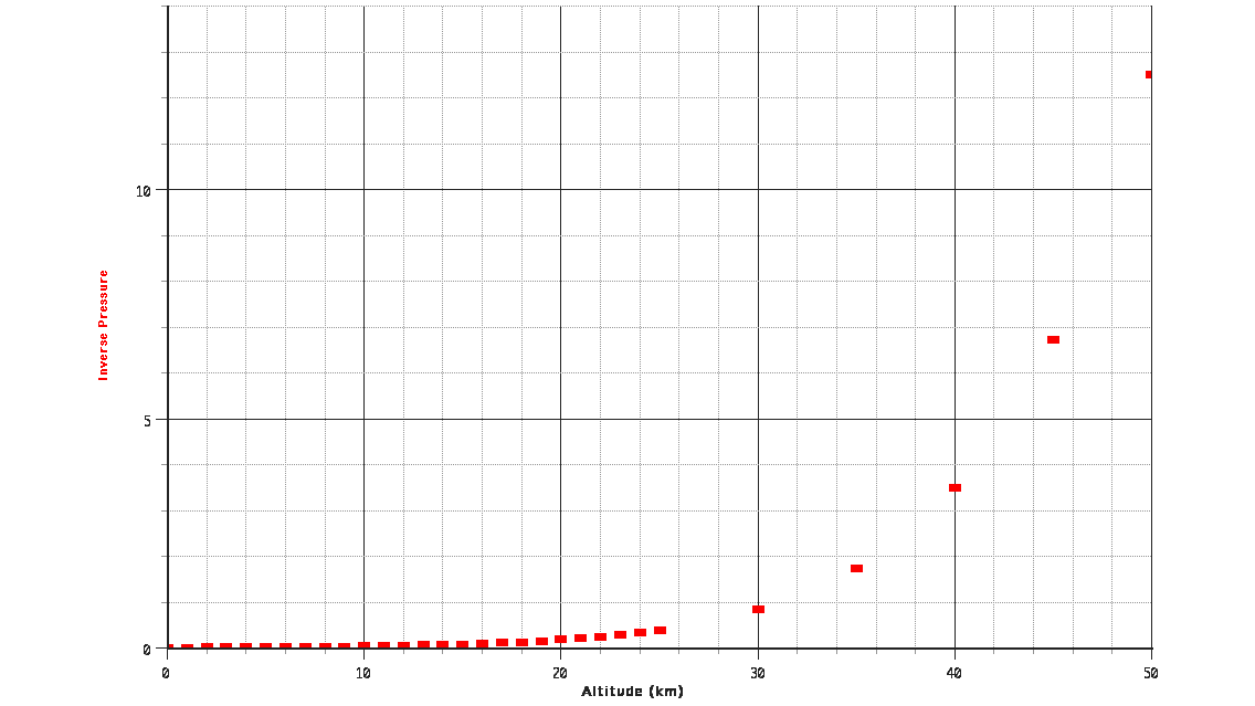
Start by examining a graph of the raw data.
 unadjusted data
Looks like it could be some sort of inverse relationship, but none of them work. "Inverse this power. Inverse that power." It seems as if nothing can straighten it out.
invert 
invert and square 
invert and square root Did I say it looks like some sort of inverse relationship? Then why does it intercept the y-axis? An inverse relationship would be infinite at zero. It would never cross the vertical axis. So what's going on?
This graph shows exponential decay. The way to make this linear is with a logarithmic function. Base 10, base e, it doesn't matter. Now we have a straight line.
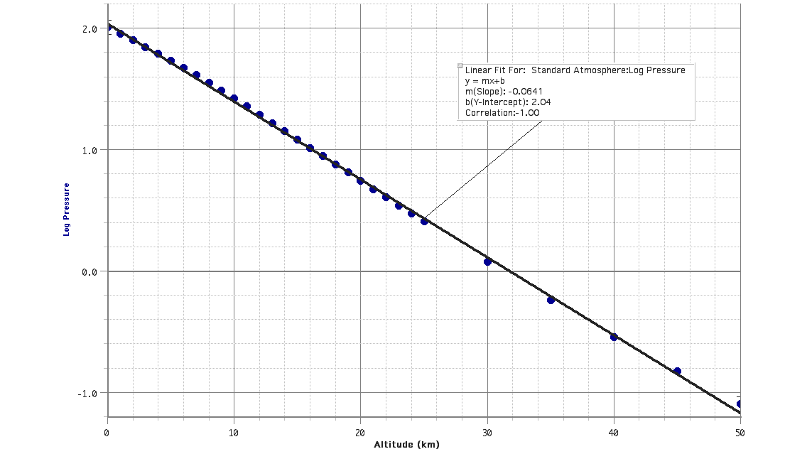 log base 10
Rearranging the variables gives…
y = mx + b log(P) = mh + b 10log(P) = 10mh + b = 10mh 10b = 10b 10mh P = 102.04 10−0.0641 h P = 110 kPa 10h/16 km Some commentary on the values of the coefficients
After transformation, the slope of the linear fit becomes a multiplier in an exponent. The magnitude of the reciprocal of this value is an important number. Whenever the altitude has this value or multiples of this value the exponent will be a whole number. The slope calculated was −0.0641 km−1. (Inverse kilometers are used as the unit to cancel the kilometers in the height.) The reciprocal of this value is about 16 km, which is conveniently equal to 10 miles for the Americans. At this altitude, the exponent in our function would equal negative one and the atmospheric pressure would be one-tenth of its value at sea level. At twice this altitude, roughly 32 km, the exponent would equal negative two and the pressure would be one-one-hundredth its value at sea level. At three times this altitude, 48 km, the exponent would equal negative three and the pressure would be one-one-thousandth its sea level value. And so on, getting ever smaller, but never reaching zero. This is what it means for a quantity to decay exponentially.
altitude (km) pressure (atm) comment 320 10−20 space shuttle orbit … … … 96 0.000001 highest airplane flight 80 0.00001 64 0.0001 48 0.001 highest unmanned balloon flight 32 0.01 highest manned balloon flight 16 0.1 50% higher than most commercial flights 0 1 sea level This coefficient should equal the atmospheric pressure at sea level, however, the value calculated (110 kPa) is significantly different from the value of the standard atmosphere (101.325 kPa). Such is the nature of statistical analysis.
Once again, it's really r2 we're interested in. This number is close to but not equal to one (r2 = 0.999). The atmosphere behaves simply when it comes to pressure and can be described adequately using an exponential decay model.